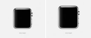
The Apple Watch is set to launch this April and there have already been plenty of sightings of this anticipated wearable out in the wild, and plenty of third parties have downloaded the WatchKit SDK to start creating apps. While we’re excited about the possibilities of this new device, smart watches have been, well, they’ve been mostly misses so far and the apps that come included are often to blame.
If your company is thinking about adding a third party app to the Apple Watch roster, what the factors should you be aware of so your app isn’t a lemon? Here are three design challenges that we see on the horizon.
1. Design for limited battery life.
Apps will need to be fairly bare-bones to avoid being the major culprit of a dead battery, so your company will need to design with minimal drain in mind. How often will it push notifications onto the screen? How often will it access the Bluetooth connection to the iPhone for GPS and other information? Will your app disable any background activity when battery life is low? Consumers are getting savvier about finding and removing apps that drain battery life. Don’t let your app be the one that gets sacrificed to the lithium gods.
2. Design for a really tiny screen.
Everything old is new again. Great apps on a smartphone will have to be completely rethought to work on a much smaller display. For example, one company that created an app for another smartwatch designed its app to display overlapping, translucent info with the primary information emphasized. This is a novel approach and companies will need to devise new methods of displaying information to succeed on the Apple Watch.
It’s not just a matter of displaying either; it’s also interacting with the small screen. The Apple Watch provides a physical dial, sure, but which actions should be a tap or a swipe on the screen instead of fumbling with the dial? How much control should be available on the watch app versus the phone app, which it will be tethered to? It’s a good idea to do your homework on what others have conceived to see what might work as you build.
3. Design with “glanceability” in mind.
It comes down to taking a scalpel to the information you can display and culling it down to the information you should display at this moment in time. Contextual relevance will be the key to glanceability.
Todoist has offered a preview of their task managing app on the Apple Watch, and to be quite honest, it still looks awfully busy on that little screen. Showing even more than one task at a time for a watch (when the full task list is available on your phone in your back pocket) seems like overkill. We’re also hoping the app takes GPS in consideration so location-specific tasks can pop up when contextually appropriate.
For more insights into mobile app design, subscribe to Rocket Farm’s RSS feed.


