We all know by now that mobile apps should be your go-to mobile solution over web apps. But is there a reason to have a good mobile web presence anyway? Yes, especially now that Google is inching closer to launching their “mobile-first index,” which may drastically impact your site’s SEO and Google rankings.
You can read more about mobile-first indexing on googleblog, but the gist is that Google will soon be launching an “experiment” and using the mobile versions of websites as the primary pages to index. So instead of a company’s desktop site being the main consideration when Google ranks for search queries, it’ll be the company’s mobile site instead. Word on the street is that this experiment may be coming in a few months.
So how should you prepare? Well, if your company already has an app, then it’s a good idea to just mimic the app to your mobile site. Here are 3 reasons why.
1. Your app is the tip of the mobile spear.

We’re a broken record here, but it’s much more important to have a mobile app than a mobile website. Here’s the simple reason why:
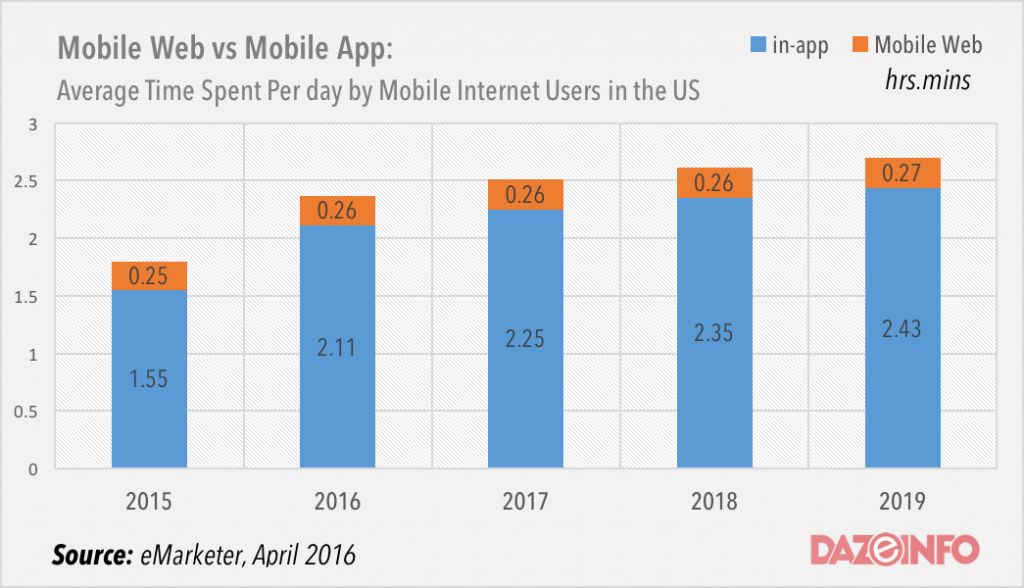
As the eMarketer chart (via dazeinfo) shows, consumers spend nearly all of their time in apps as opposed to mobile websites. Thus it just makes sense to put your design and development calories into your app first, and then port the work over to the mobile site. No matter how much Google’s spiders and robots want to crawl your website, your actual customers prefer an app when they’re on the go. Be sure to make the app experience great before anything else, and not the other way around.
2. Less of a learning curve.

From the data above, it’s safe to assume your mobile customers will be more familiar with your app than your mobile website. So making sure the latter looks and acts like the former gives them a better user experience. Having two different mobile experiences, be it layout or navigation or functionality, will only confuse and frustrate the user.
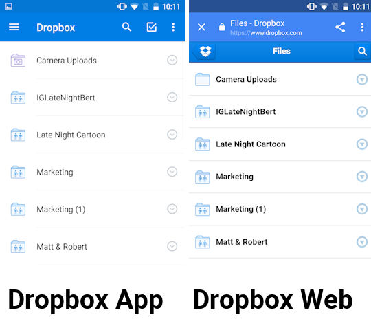
Take a look at the Dropbox app and mobile website:
Pretty identical. If you’ve used the app, you know how to use the mobile site too. Of course, for many companies it may not be this identical, but by mimicking as much of the design of your app as possible, your users will have a seamless transition if they ever do utilize the website. As a bonus, your mobile website can act as a “backup” to your app, in case the latter experiences some technical glitch.
3. It’s already optimized for speed.
If you’ve already got an app out, it’s likely that you’ve stripped it down to just the essentials in order to keep it small, light, and zippy. So if your app already is optimized for mobile use, why would you have a bloated mobile website that tries to cram in everything from the desktop site?
A mistake that many companies make is to just port the desktop site to mobile, but that can lead to a clunky and over-dense user experience. Even “mobile optimized” sites can have too much text that an on-the-go user won’t want to sift through. Consider this quote from appticles.
A global study by GfK and BlackBerry Limited has shown that 69% of business smartphone users are “constantly looking for new ways to get things done as efficiently as possible”. On the other hand, desktop users are more open to design elements, such as boxed testimonials of quotes, which may not support their main informational needs directly.
These days, no company should port over their desktop site. Port over your app instead.
Is your mobile app ready to become your mobile website?


