Download our E-BOOK
4 App Design Lessons I learned From My Parents
January 5, 2016
by Ashley Rondeau
My holidays were fine, how was yours? Good! To make the time go by, I decided to observe how my parents used their iPhones. They’re in their sixties, and only got iPhones a year ago, making them adept at using them, but not experts by a long shot. So I wondered: how do my tech-challenged folks use their smartphones, and how does their usage speak to app design? After all, the Greatest Generation is embracing technology more than you’d think, so they make up a big target audience for app developers. Here are 4 things I learned watching my parents interact with apps.
1. Notifications need to be simple and logical…to delete.
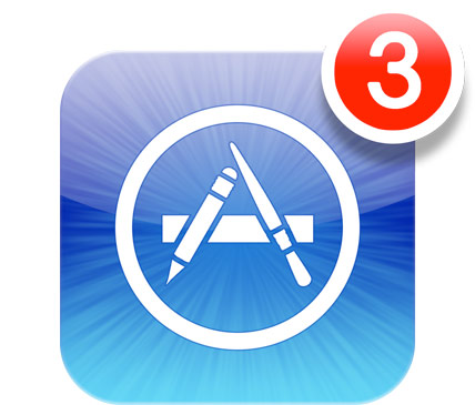
 The very first thing my parents did when I arrived, after feeding me, is hand me their phones and told me to “make all the red numbers go away.” Wow, did they hate those notifications. Because of the whole “teach a man to fish” philosophy that I ironically learned from my parents, I asked them to try to get rid of them first.
A few times, they did it just fine. The notifications themselves and the steps to remove them were intuitive. However, in many instances, the poor design of the app made me realize that if you’re not used to notifications, it can be a frustrating exercize in trial-and-error to figure out what you’re supposed to do. Some apps would have a red notice (often pulsing, to my parents’ great annoyance) and when you pressed it, it wasn’t immediately clear on the next screen what exactly they should be looking at.
I had no idea how bothersome a homescreen or app full of red notifications can be until my parents pointed it out, and this is a good thing to keep in mind when designing your app. If you can’t get rid of the red number in two touches, your logic can be simplified.
2. Quick access to favorites & remembering preferences is key.
Unlike the younger generation, my parents used their iPhones as phones. As in, using it to actually talk to another person. One day, my mom was trying to call a friend she knew she had called before, but couldn’t find her in her recently dialed section. Since she finds it difficult to save numbers by creating a contact profile, she just uses the recently dialed lists until she sees the phone number she semi-recognizes.
After I saved the contact for her, I also reminded her how to access her most frequently dialed numbers and saw her eyes light up. Here was all the numbers she called the most in one easy-to-find list! While she went off to show my father, this interaction showed me that while our smartphones can do nearly anything these days, it’s important to make the things you do the most as easy as possible. For my parents, and for a lot of us, an app that learns our favorites and preferences can make navigating the app so much easier.
Another example: my dad complained to me that he has a hard time getting to my Facebook profile. Fascinating! It seems easy to me: just type the person’s name into the search bar. But my dad a) hates typing on the little screen, and b) didn’t even realize the search bar existed. So he would have to open the Facebook app and just scroll through the timeline until he saw a post by me. Sometimes, he would click on a friend of mine, then click on “suggestions,” and find my profile that way. Watching him navigate showed me that it would be easier if the Facebook app could learn that I was a frequent “contact” for him and put my profile somewhere as a frequent destination.*
*The desktop version of Facebook sort of does this.
3. Pressing is intuitive, swiping is not.
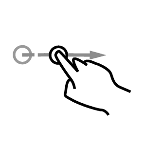
 My parents get buttons. They see a button or even a link on screen, and they can push it like a pro. Swiping, on the other hand, was not an intuitive move for them. It makes sense: they grew up with buttons. Everything had them: microwave, TV, TV remote, washing machine. Swiping? When did they ever do that?
Because it wasn’t intuitive, they didn’t realize that swiping was an action they could take on many apps to access menus and shortcuts. Each time I showed them that what they wanted was behind a swipe, they asked “well, how would we know that?” Fair enough! It was a great reminder that app design has to make clear what actions are available to the user at all times. In other words, as Don Norman said, it’s all about “perceived affordance.”
And it’s not a bad idea to remember that pushing a virtual button is still much more intuitive than swiping pixels on a screen.
4. Make apps legible.
The complaint I heard the most? “That’s too small to read. Where are my reading glasses?” This happened over and over again, and as they sat with their phones at night, I could see them squinting to read on the tiny screens.
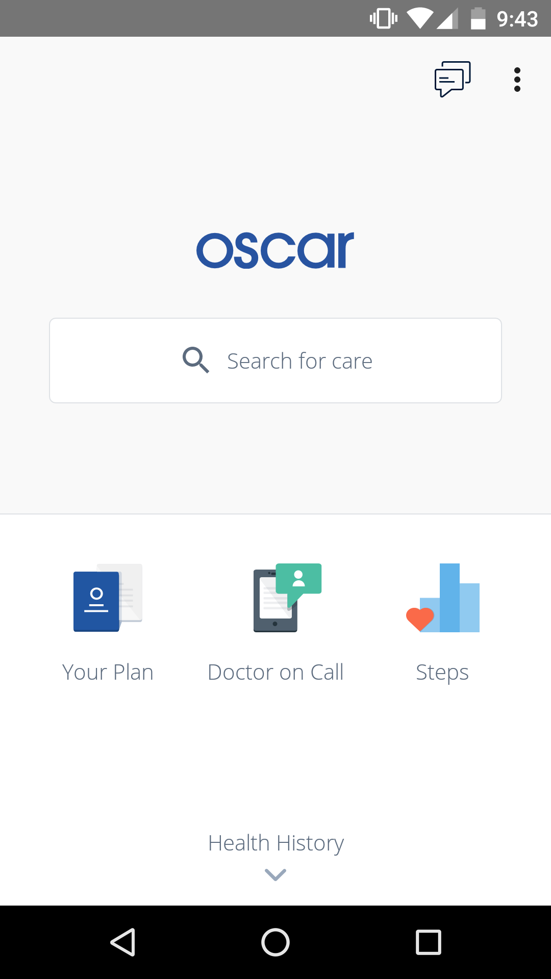
Some apps were clear, uncomplicated, and legible. They liked those apps. During a conversation about my health insurance (since they’re my parents, of course), I showed them the app I use to manage my Oscar Health.

They actually stopped me and said “oh that is a nice looking app. Looks easy to use.” And they’re right. It’s an extremely simple and clear app to read. It’s almost minimalistic. They don’t know anything about actual app design, but they knew what they liked. It was another lesson on how to design apps for the masses. Keep it clear, keep it simple.
Maybe “can my mom use this app?” is the question we should be asking ourselves whenever we build. What do you think?

Ready to turn your app idea into a market leader? Partner with Rocket Farm Studios and start your journey from MVP to lasting impact.”
Teams for App Development
We help companies build their
mobile app faster with go to market strategy

Technology and UX Audits

Early Design Sprints

MVP Creation

App Store

Growth Teams
Download Our Free E-Book
Whether you’re launching a new venture or scaling an established product, Rocket Farm Studios is here to turn your vision into reality. Let’s create something extraordinary together. Contact us to learn how we can help you achieve your goals.


